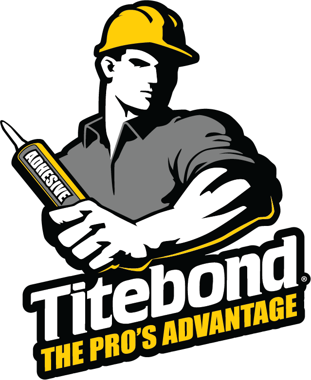
The extensive re-packaging program features an eye-catching label redesign that accentuates the brand name and Titebond’s iconic brandmark – the construction pro – and tagline. The redesign strengthens the Titebond identity while also clearly distinguishing each product by specific adhesive technology and key performance characteristics.
Titebond construction adhesives are getting a new look that is as powerful as the products themselves.
 As part of a comprehensive program to promote both the brand and its focus on products formulated for professional use, Titebond has redesigned labeling for its full line of construction adhesives. The new labels unify the line under the Titebond brand and emphasize the brand’s focus on the construction pro. While the label design clearly identifies the products as Titebond, each product also is easily distinguished by its specific color and call outs.
Brighter colors and bold graphics catch the eye and evoke a sense of strength and innovation. The dominant design element is a striking update of the Titebond logo, graphically tied to a powerful brandmark – a brawny construction pro gripping a cartridge of the labeled product – along with the brand’s tagline, “The Pro’s Advantage.”
The new labels instantly convey key product information to guide the contractor or DIYer toward the product that meets user preference and application requirements. The product name is in large, white letters outlined in black, popping out of a brightly colored rectangle of the hue specific to that product. A callout above the product name states a primary product feature, and three distinctive characteristics of the product are indicated immediately below the product name. Customers can easily select products that are waterproof, water resistant, all-weather, fast-grabbing or meet other performance requirements.
Although Titebond has retained its adhesive sub-brands, including GREENchoice™ and PROvantage™, the Titebond brand name dominates the logo to emphasize that those products are in the Titebond family of construction adhesives. Sub-brands, as well as specific type of adhesive technology (water-based, solvent-based, VOC-compliant solvent, advanced polymer, polyurethane), are located below and to the left of the product name.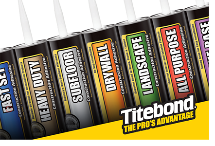
“Titebond is a well-known – and well-respected – brand within both the construction and woodworking industries,” said Mark Schroeder, vice president, marketing at Titebond. “In emphasizing the brand name and our commitment to serving the construction pro, we also underscore that our products are formulated to meet the highest performance requirements. That’s important to the pro as well as the skilled DIYer. Beyond that, we make it easy for customers to find the best adhesive for a given project. We believe the new packaging is what these products – and our customers – deserve.”
The new packaging will begin appearing on store shelves Fall 2019. Titebond expects to switch all products in the current line of construction adhesives over upcoming months.
More information on construction adhesives and other Titebond products is available at www.Titebond.com.
###
Media Contact:
Jeanne Tranter, 614.445-0888
jtranter@trantercommunications.com